Following my last post about designing my antagonist character, I looked at the designs I had and played about with a few of them. The goal with my antagonist was to make a design that seems friendly at first, but implies something much more villainous.
I wanted a 'friendly' and a 'villain' design because I imagined a two-phase final boss fight for Russi; I also thought that because I have been exploring family for a mascot this semester, the friend to villain arc would be interesting for players and allow them to form a love-hate bond with the character.
The designs I liked the most are the 2 genie designs on the top row, the cat and the first ghost on the second row, and the wizard with the crescent moon on his hat on the bottom row. The genies were interesting to me as they were a bit more outside of the box for my "mage" concept. Next is the cat, she was good in the sense that Russi herself is also anthropomorphic so they would tie together thematically. These three designs were scrapped because I felt like I would struggle to use those designs to infer a villainous form like I had intended.
This meant the designs I wanted to look at further were the ghost and wizard designs. The two of these designs had shapes that I could use for the villain form (like the bow on the ghost could become large horns) or the fact there is something unusual about them that could quickly go from interesting to scary (like the fact the wizards hands and feet float away from his body, showing that he is clearly not of this world).
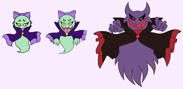
I took the original designs and made some small adjustments, then I drew what I called a "second form" which was where I changed a few elements to show the beginnings of their villainous form (such as claws and evil mouths that were previously obscured).
Lastly, I sketched out a villain form for each of these designs; it became apparent to me very quickly that the ghost design was the stronger one, both in my own opinion and in the opinions of my peers. The reasons for this are how she is rounded and cute in her friendly form, yet still mysterious, but it becomes very clear how the elements of her design transform to become the villainous ones. I used the shape of her bow to create horns, I tilted the angle of her eyes to make them angrier and made her grin maniacal, gooey and gross. Importantly, her hands are hidden under her cloak in her friendly form, which gives her a sense of mystery, then they are revealed to be claw-like and translate in the change of shape from the round, friendly design to a more chaotic, spiky villainous design.
I did still make an attempt to create a concept for the wizard as well but I felt that I was wasting time and felt much less inspired with this design.
After this, I moved on to creating some colour palettes, I knew that I wanted to give the villain 2 colour palettes: one for the friendly form and another for the villain form that is a stark contrast. Colours like purple promote thoughts of mystery, red gives a sense of danger and dark tones are generally associated with malice. For this reason, I knew these were the kind of colours I wanted to work with for the evil form - the challenge came with creating a palette that was both different to the villain colours and was suitably different to Russi's (much more difficult than it seems with Russi's triad colour scheme).
I experimented with a mixture of muted and bright tones, the sheet above was supposed to just be exploring colours for the friendly form but I realised I had used those villainous colours I mentioned in the last paragraph for one of them without really realising. The palette I decided to use for the villain form is the top left, and the friendly form is the bottom right one; this is because the body colours of the two designs (purple and green) are directly opposite each other on the colour wheel, and the purple elements of the friendly colour palette work to infer the villainous form which also has a lot of purple on it. The yellow from the eyes would also carry over, this also works to tie the palettes in with Russi's without being too similar since her palette has a large focus on yellow. I also liked my use of the dark purple, it's not an evil colour but it also goes to imply the darkness hidden away under the cloak.
Having decided both colour palettes, I painted them onto the different forms. Instead of keeping her pupils in the villain design, I put crazed swirls in the eyes, to imply she has gone mad with power.


No comments:
Post a Comment