I'd like to look into each of these and pit them against the character designs I've brought forward from my questionnaire, deciding what does and, importantly, what does not correlate to what should make a good mascot. From there I should be able to fine-tune and bring forward a finalised design for a mascot that I can proceed to use in the context of a video game and relevant advertisement. Rather than using all of the characters I want to iterate on, I'm just going to compare a couple in this post and show developmental work on the others in a future post.
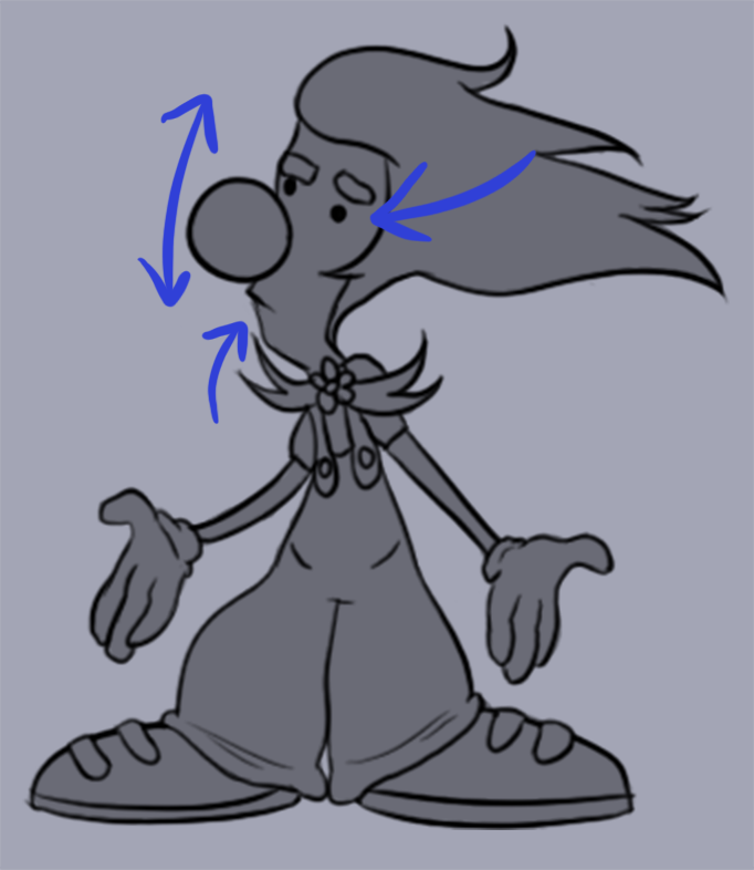
Let's begin with facial expressions - as human beings, we are naturally drawn to the eyes on other humans before anything else. This is ingrained in our minds from a young age as a way to gauge emotion from the other party. Why then, should a fictional character be any different? The truth is, it isn't. Whether we think about it consciously or not, people are always drawn to the face first. As such, it's important that this gives the best first impression it can to the consumer. Different facial features, their distance from each other, the size and the shape of these features all have an impact and can say different things about the subject. For example, the babyface effect - where the head seems proportionally larger, the eyes are larger, the nose less defined, lips fuller and so on - is often used to make characters seem "cute". It invokes a need to protect the character, due to their similarities to an infant, and allows them to protrude a sense of innocence. Adversely, a character who has more defined features - like a prominence to their nose, a sharper jawline, thinner lips and smaller eyes - can be seen as mature, responsible, but perhaps also less friendly. While mascots tend to lean towards larger facial proportions, anything goes, but the character should at least be able to emote, thus using their facial expression. This helps bring them closer to the consumer and gives a sense of their personality. Protagonist characters are also often attractive, Katherine Isbister points out in 'Better Game Characters By Design', because more attractive and cleaner people are stereotypically associated with positive attributes like intelligence, trustworthiness and success, though there are also exceptions to this rule.
 |
| This character's face is longer which suggests he might be more sombre (think of the expression: "Why the long face?"). He has small eyes which may be less friendly, but the presence of his eyebrows and a mouth means he can express more varied emotions. |
 |
| This design has a rounded head and big eyes, typical of characters sporting the babyface effect. However, she has no mouth which limits her expression. It's possible to deduce innocence and a shy personality from these features. |
The next element I'd like to discuss is shape, which is arguably more important for fictional characters than facial expressions are. The web article "How to Convey Character's Personality Through Shape, Variance and Size", based on the practices and researches of David Colman (an Emmy award winning character designer), begins by discussing three primary shapes for characters. First, the square, which is a shape that is present in rock forms in nature. When applied to a character, it gives a sturdy, confident and dependable quality, as such it is usually used for strong characters, often heroes. (Think of someone like Captain America, a strong jaw, broad shoulders etc.) Next is the circle, this is a soft shape which we psychologically associate with harmless and friendly characteristics. For this reason, mascot characters very often have a lot of circular shapes to them (like Mickey Mouse, for example, who is almost entirely made from circles). Circles also take us back to the babyface effect, infants and baby animals tend to have much rounder features (like their eyes, their faces and even their over all body shapes are often much more rounded than their adult counterparts). The last shape I'd like to talk about is the triangle, this shape is found often in dangerous places in nature, such as broken shards of glass, and is often associated with wild, erratic or otherwise negative behaviours when applied to characters. As such triangles are often used to represent villainous characters, but they can be used for protagonists too (Crash Bandicoot, for example, who has a wacky personality).
 |
| This character is formed from lots of soft and circular shapes. She comes across as friendly and harmless. |
 |
| In contrast, this character's shape is predominantly triangular. While unusual for a protagonist character, triangles accentuate more erratic personalities. |
The third fundamental I've looked at is colour. Subconsciously we associate colours with different emotions, while subjective to an extent there are still trends in what we see; for this segment I've looked at a web article titled "Color Psychology: The Emotional Effects of Colors". The article in question discusses the psychological effects and things we associate with each colour. It is a known fact that colours are used in marketing because of the subliminal things we link to them. For example: the colour red is associated with love, warmth and comfort; blue on the other hand is associated with calmness, wisdom and loyalty. Taking these two examples into consideration, a design like Super Mario's begins to make a lot more sense, since he exudes qualities of both of those colours in his personality.
 |
| This is an example of colours that contrast with the character's design. (shades of blue = melancholy and black = evil) |
 |
| A colour palette should accurately reflect the personality traits of a character. (eg. white = innocence, pink = romance, red = warmth, grey = neutral) |
 |
| As a clown you might expect a design with lots of contrasting colours, but for a mascot character, specifically, the palette should not be overly complex. It sends too many messages about his personality and isn't easily memorable. |
 |
| The colour palette for a mascot character should be constrained to no more than around 5 colours. This helps make the character memorable and there is no confusion about their personality traits through the colours used. |
The final aspect of mascot design is cultural adaptation, for this I'll be referencing the book "Better Game Characters By Design: A Psychological Approach". Katherine Isbister explores many facets of making a good character design in the context of games, but I found out a lot about the effects of culture in particular. Every culture and subculture has different things that they find acceptable and are most socially attracted to subconsciously. With this in mind, character designs may have to be "localised" for different regions - for example, in Japan there is a heavy influence of anime and manga which results in the acceptance of bigger eyes and smaller noses in their character designs. In America and Europe, it might be more frowned upon to like these characteristics, since they're very typically cute. Below I've listed a couple of examples of character/marketing changes for Eastern and Western markets.
 |
| Left: US box art for Crash Bandicoot 1, there is a lot of black space and the background colours are quite muted, as well as the palette of Crash himself. In Western culture is it often seen as childish to like brightly coloured characters, they should at least be "cool". The ripped effect adds an aura of strength to Crash's character, as if he is the one who created the burst opening, which amplifies his cool factor. Crash's features are sharp, like his ears and his hair. He has a wide, almost crazed, grin and bright green eyes. Right: Japanese box art for Crash Bandicoot 1, in contrast to the American box art the background and Crash himself have very high contrast and there is colour everywhere you look. Crash's eyes are different sizes to accentuate his animated personality and his irises are black, since green eyes would be highly unusual in Japan. His smile is also more subdued, this stems from the Japanese belief that one should control their facial expressions to a greater degree. The shapes of Crash's ears and other features are also more rounded which amplifies his cute factor to the Japanese audience. |
 |
| Left: Japanese box art for Sonic the Hedgehog 1, the background is compiled from abstract geometric shapes which help draw the reader's eye to Sonic. He is also placed on the right of the box since Japanese people read from the right. Japanese advertisement is often prevalent with English phrases too - Douglas Goldstein explains in his thesis "The Use of English in Japanese Advertising", that this is both decorative and communicative. Sonic's original Japanese design is a lot more rounded and friendly, reminiscent of the likes of Mickey Mouse. The colours used are closer to pastels which are often used for Japanese character designs. His eyes are large which amplifies a friendly personality. Middle: US box art for Sonic the Hedgehog 1, Sonic's quills are much more like shark fins, making him seem "cooler" - his eyes are also smaller (or at least the ratio of white to iris is less) and he has a noticeable furrow to his brow, adding more attitude. His colours are much higher in contrast and the bright background behind him, coupled with the black border, draws the eye to the middle of the box. There is very little text on this box art which leads me to believe that, culturally in the West, we are less inclined to spend time reading and would rather learn visually. Right: Lastly, the European box art for Sonic the Hedgehog 1, I found this interesting as it takes elements from both the Japanese and American box arts. They use the Japanese Sonic design and the background is reminiscent of the geometric Japanese one, but with characters from the game also showcased. From the American box art, they've taken the black border with to-the-point text. |
Sonic the Hedgehog, while being conceptualised at SEGA's Japanese HQ, didn't actually find popularity in Japan first. SEGA of America handled the "Americanised" redesign of Sonic - his cultural adaptation, if you will - and their marketing campaign ended up bringing success first (I've already done a big write-up about that if you're interested). It was tough to get the Japanese team to agree to Sonic's redesign for Western audiences, but eventually they accepted. What I find most interesting is how the European advertisements made use of the Japanese rather than the American version of Sonic. After the 'classic' Sonic era, Sonic's design became standardised globally.
And as a final point of reflection, a mascot should adhere to the following: keeping a consistent style so consumers will not be confused and, perhaps, deterred from the character or product they're advertising; and keeping the design from being too complex, simple enough that a child could draw a portrait of it.
Now that I have a better idea of what, fundamentally, makes a good mascot character I feel that I'm ready to redevelop character concepts. From there, I'll begin to think about creating a game, how I can use the character's design to create fun game mechanics and equally how I can use game mechanics as a way to develop the character design.
References:
Art Therapy. (2011). Color Psychology: The emotional effects of colors. Retrieved from http://www.arttherapyblog.com/online/color-psychology-psychologica-effects-of-colors/#.WfpruFu0MqN
Bilyana / GraphicMama. (2016). How to convey character's personality through shape, variance and size. Retrieved from https://graphicmama.com/blog/conveying-characters-personality/
Cook, L. (2017). Crash Bandicoot vs Super Mario: A critical analysis & comparison into the fundamentals of designing a mascot (BA (Hons) Computer Games Enterprise).
Isbister, K. (2005) Better game characters by design : A psychological approach, San Francisco, Calif., San Francisco, Calif. : Morgan Kaufmann.
Goldstein, D. (2011). The use of English in Japanese advertising (H&SS Senior Honors).
Brands, M., Brands, R., & Terpstra, A. (2017) Sonic the Hedgehog 25th anniversary artbook, first edition, Amsterdam, The Netherlands, Cook & Becker.
No comments:
Post a Comment